


One Dark & One Light
만든 사람 @CatVinci-Studio · MIT
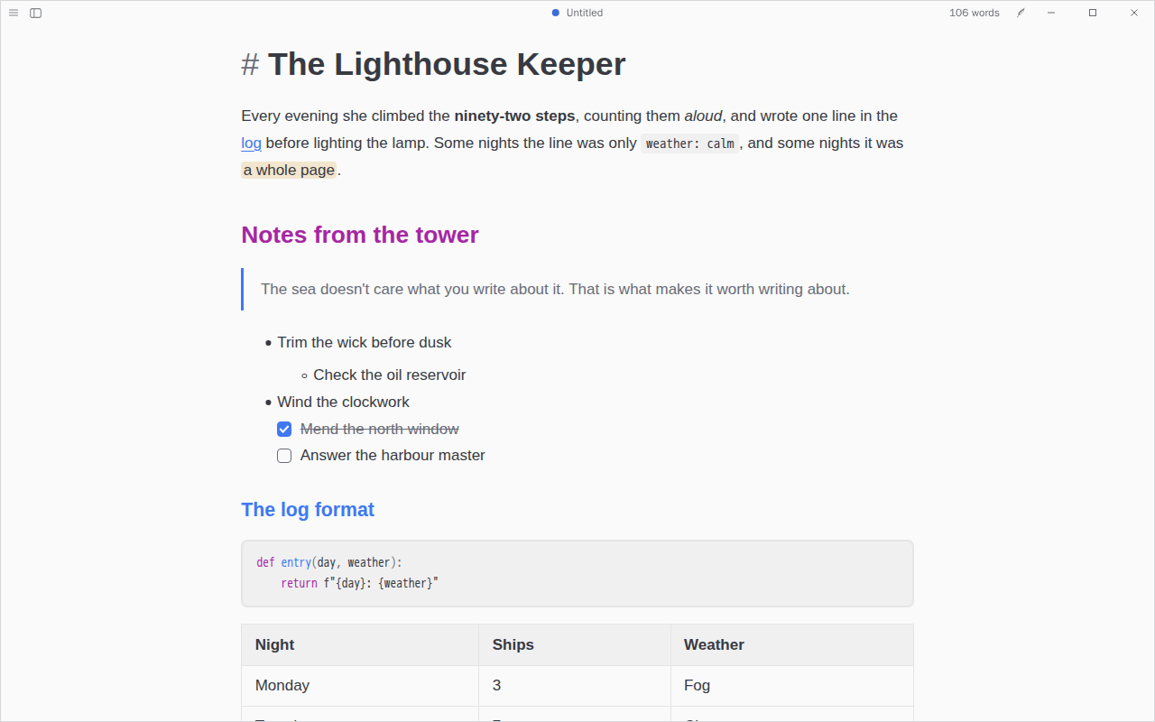
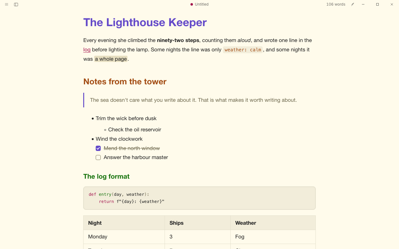
A coder's favourite for writing: One Light by day and One Dark at night, blue links, headings stepping through purple, blue, green and gold, and code in the same colours. On the Atom One palettes.
Textus의 테마, 플러그인, 스킬입니다. 여기서 둘러보고 앱의 설정 › 확장에서 설치하세요.
문서의 모습. Textus로 글을 쓰는 사람들이 만들고 나눕니다.
만든 사람 @CatVinci-Studio · MIT
A coder's favourite for writing: One Light by day and One Dark at night, blue links, headings stepping through purple, blue, green and gold, and code in the same colours. On the Atom One palettes.
만든 사람 @CatVinci-Studio · MIT
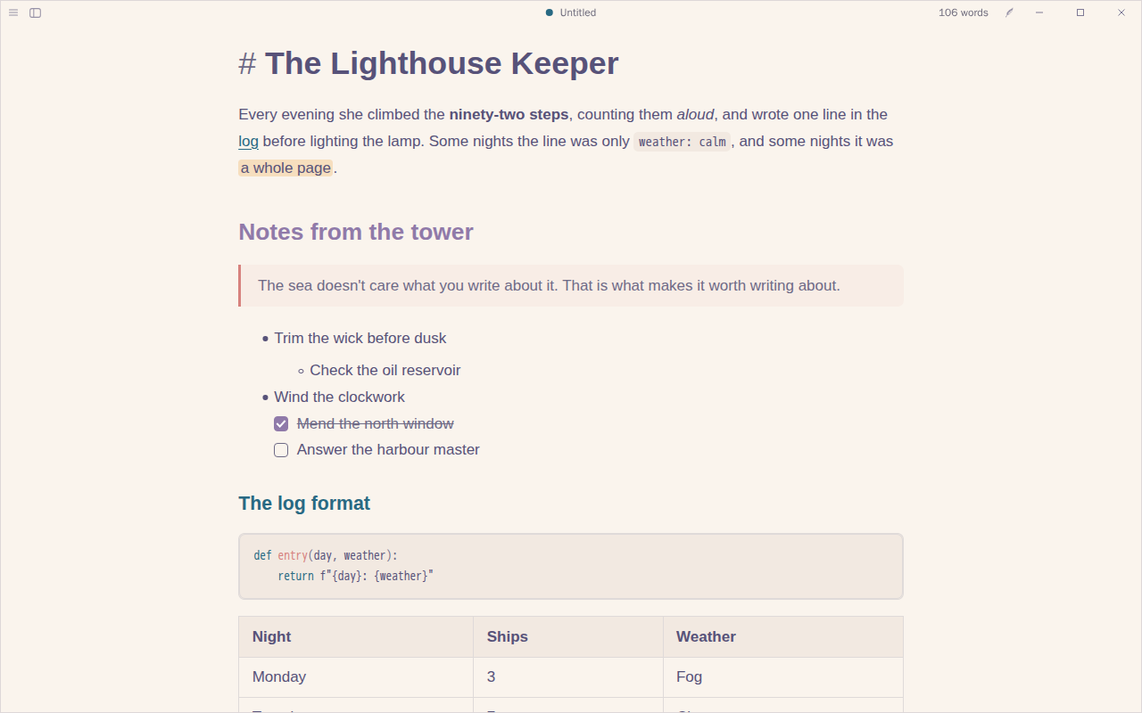
Soft and natural: Rosé Pine Dawn's warm paper by day and Rosé Pine's deep night after dark, iris accents, pine links and rose quotes. On the Rosé Pine palette.
만든 사람 @CatVinci-Studio · MIT
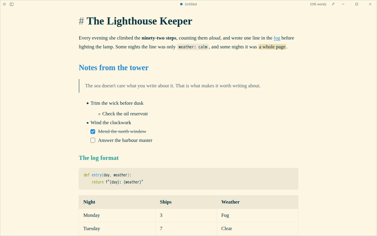
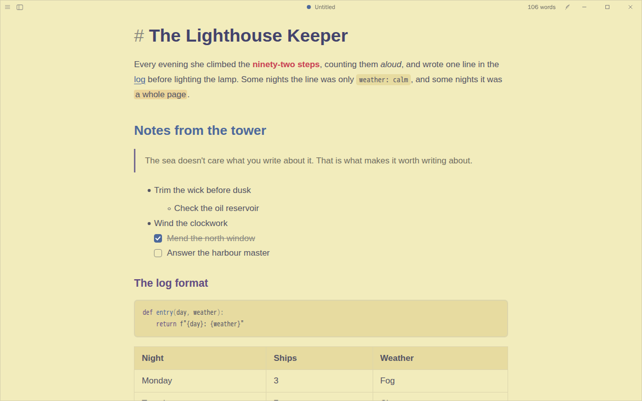
Calm, low-glare colours for long reading: Solarized's warm light page by day and its deep blue-green one at night, blue links, cyan and green headings and orange code. On the Solarized palette.
만든 사람 @CatVinci-Studio · MIT
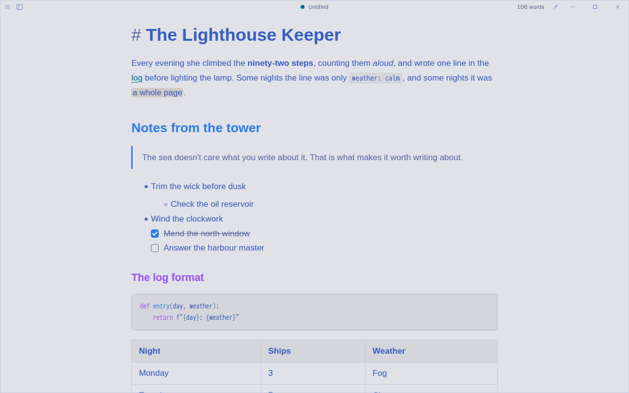
Clear and electric: Tokyo Night Day's pale blue page by day and the Night palette after dark, blue headings, purple and cyan accents, and code in the same colours. On the Tokyo Night palette.
만든 사람 @CatVinci-Studio · MIT
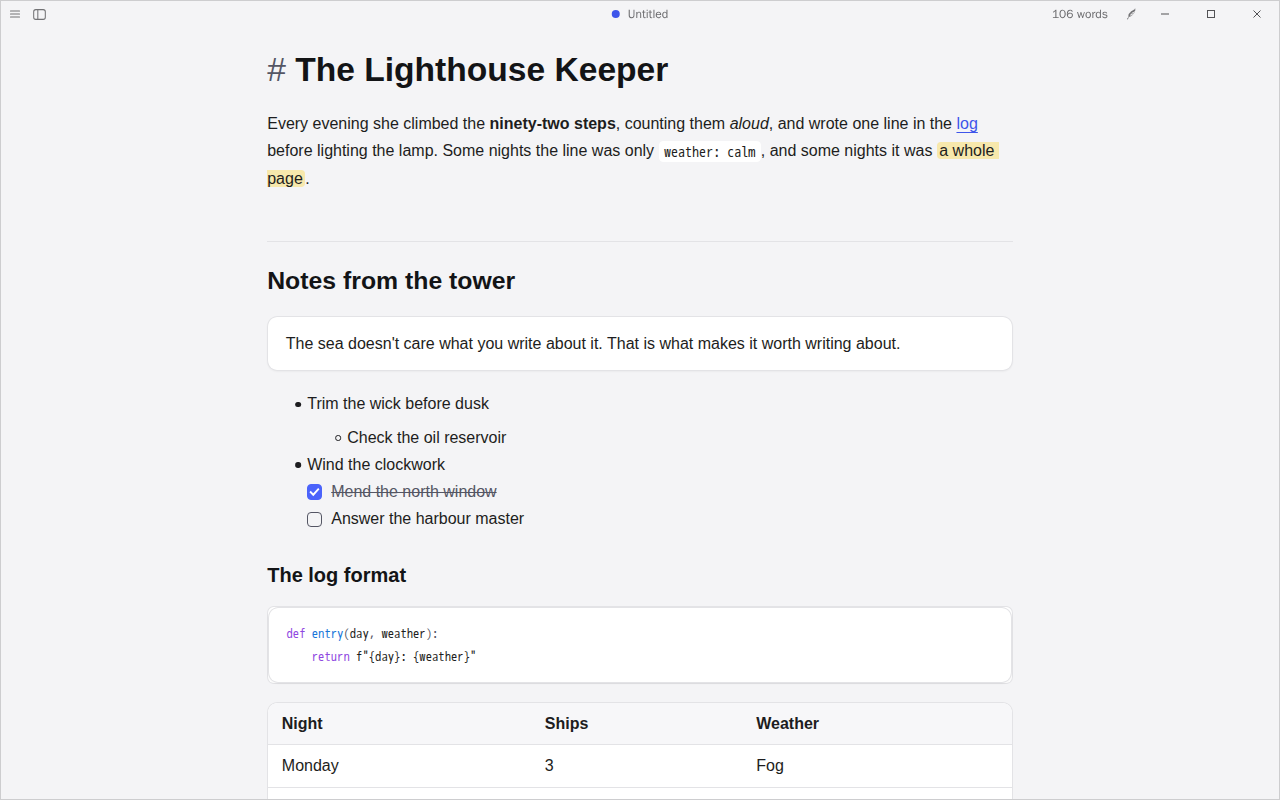
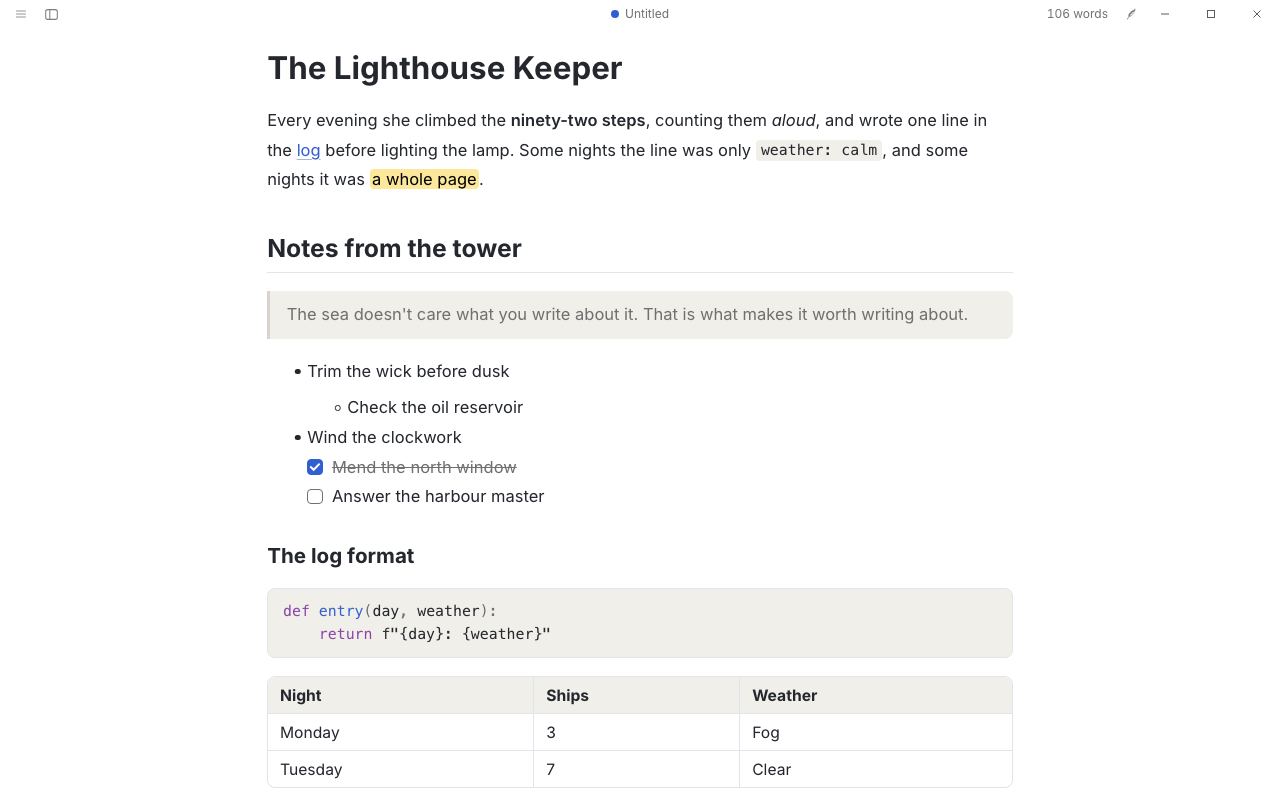
For notes you keep in order: quotes, code, tables and callouts each sit in a rounded card on a soft grey page, with an indigo accent, and level-2 headings open a section over a rule. Layout and colours after Border, our own CSS.
만든 사람 @CatVinci-Studio · MIT
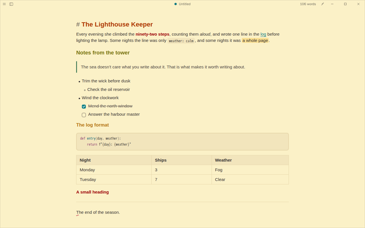
More on a screen without crowding it: a 15 px sans with tight lines and paragraphs on warm Gruvbox paper, headings set apart by colour rather than size. For lists, logs and quick notes. Density and colours after Shimmering Focus, our own CSS.
만든 사람 @CatVinci-Studio · MIT
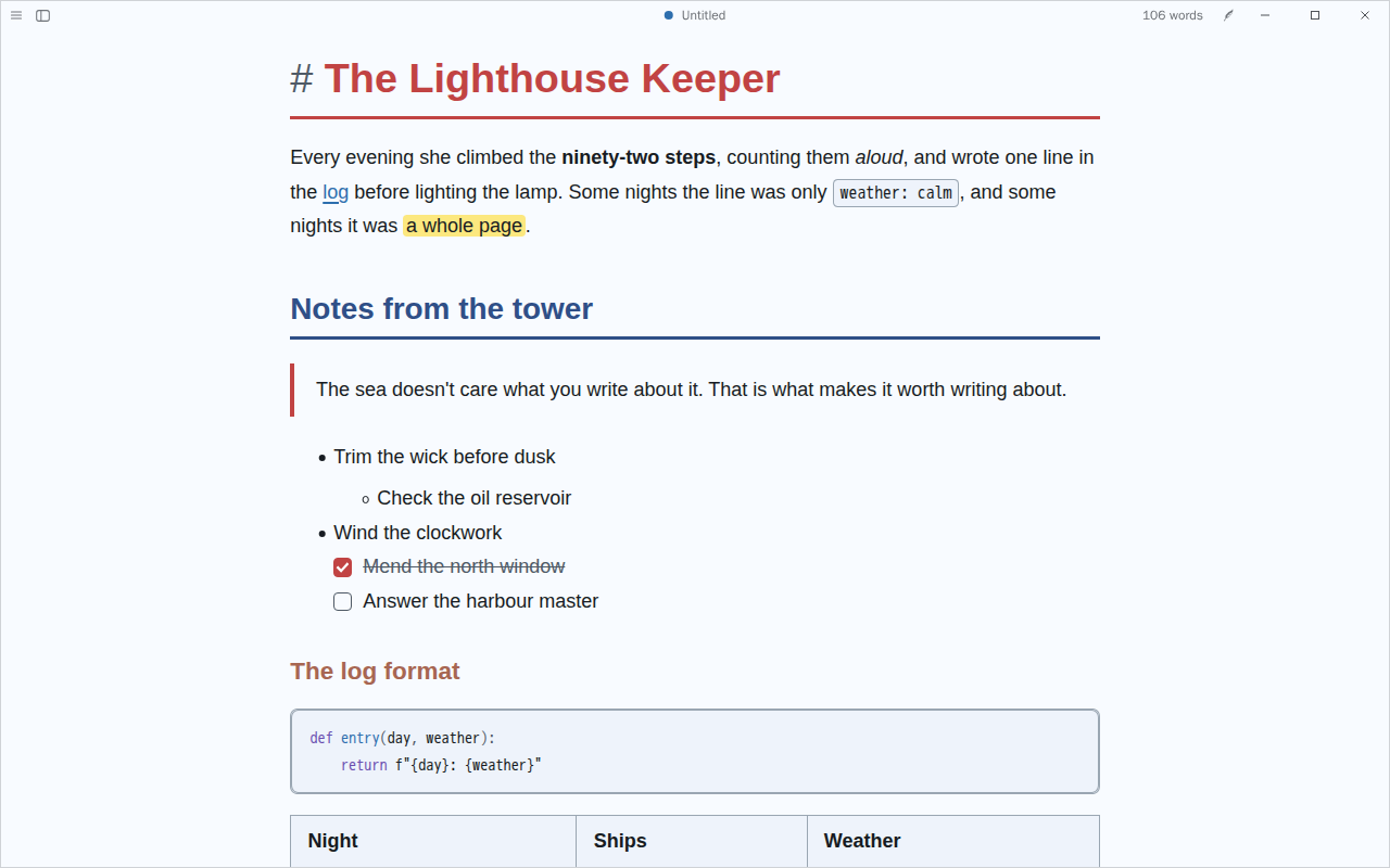
Clear for long reading and research notes: near-black on a cool white page, 18 px type, red and navy headings, links always underlined, a firm rule under top headings and code set apart by a border. Body text meets WCAG AAA. Colours after ITS, our own CSS.
만든 사람 @CatVinci-Studio · MIT
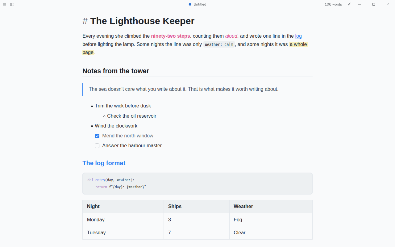
For plans, to-dos and outlines: a clean sans on a cool white page, headings that change colour by level, pink bold and teal quotes, and roomy list items. Colours after Things, our own CSS.
만든 사람 @CatVinci-Studio · MIT
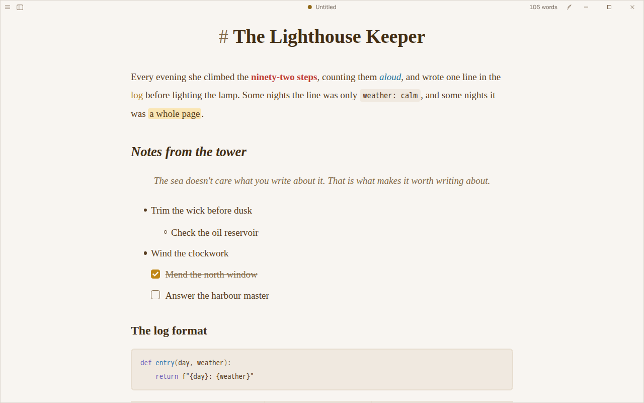
Like reading a well-set book: a large serif on warm paper in brown ink, wide lines and generous paragraphs, bold in red, italics in blue and links in gold; a lamp-lit page after dark. Colours after Primary, our own CSS.
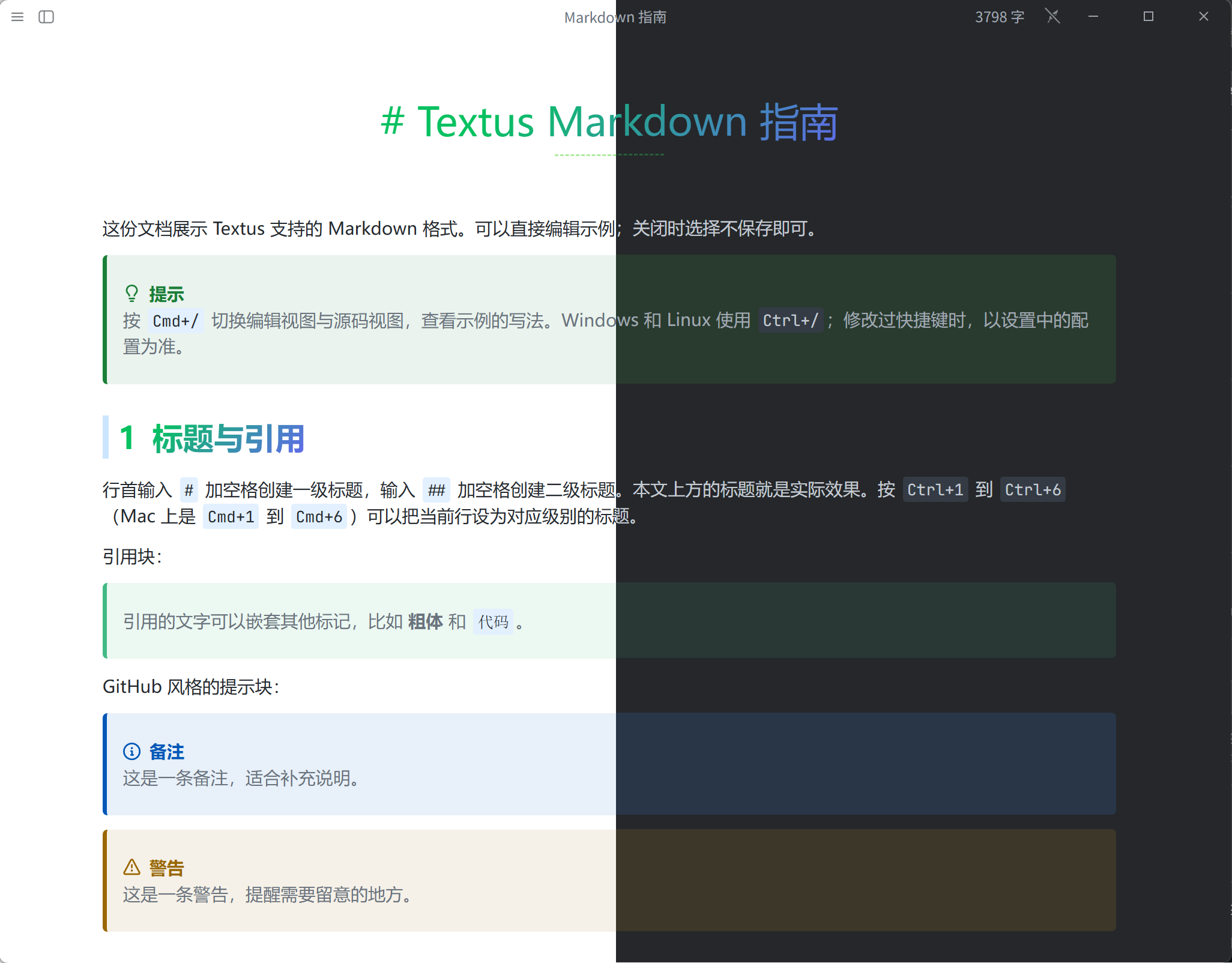
만든 사람 @CatVinci-Studio · Apache-2.0
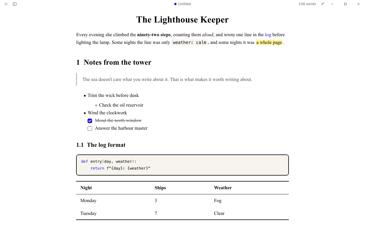
Like a typeset paper: a Computer Modern style serif, numbered sections, booktabs tables and plain links, on white or on black. After LaTeX Typora by shamsghi.
만든 사람 @CatVinci-Studio · MIT
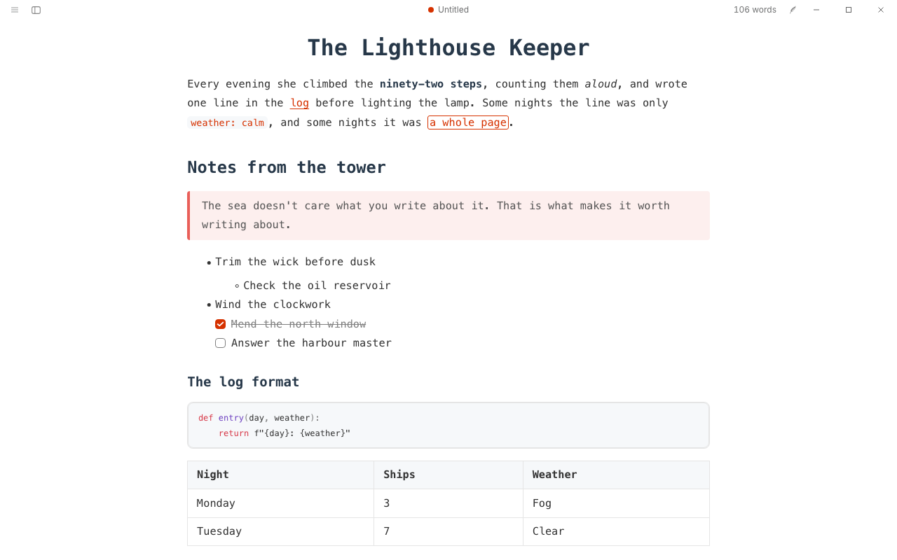
A writer's terminal: every word in a coding font, a centred title, one slate colour for headings, tinted quotes with a coloured bar and outlined highlights. After Drake by liangjingkanji.
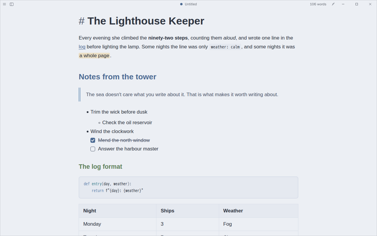
만든 사람 @CatVinci-Studio · MIT
Arctic and calm: a snow-storm page by day and polar night after dark, headings and links in Nord's frost blues and a double quote rule. On the Nord palette.
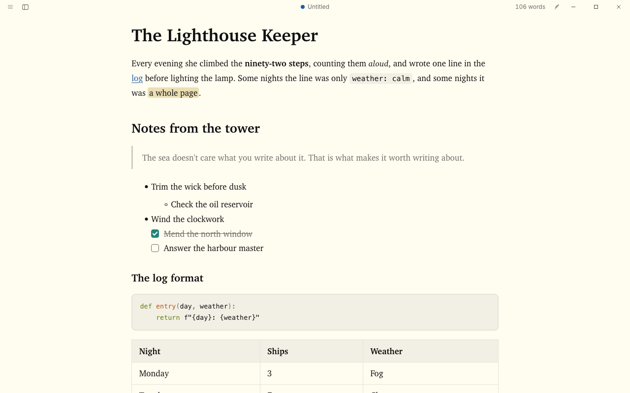
만든 사람 @CatVinci-Studio · MIT
Ink on paper: a warm paper page and a near-black one, headings in ink, cyan links and quiet code. On Flexoki by Steph Ango, https://stephango.com/flexoki.
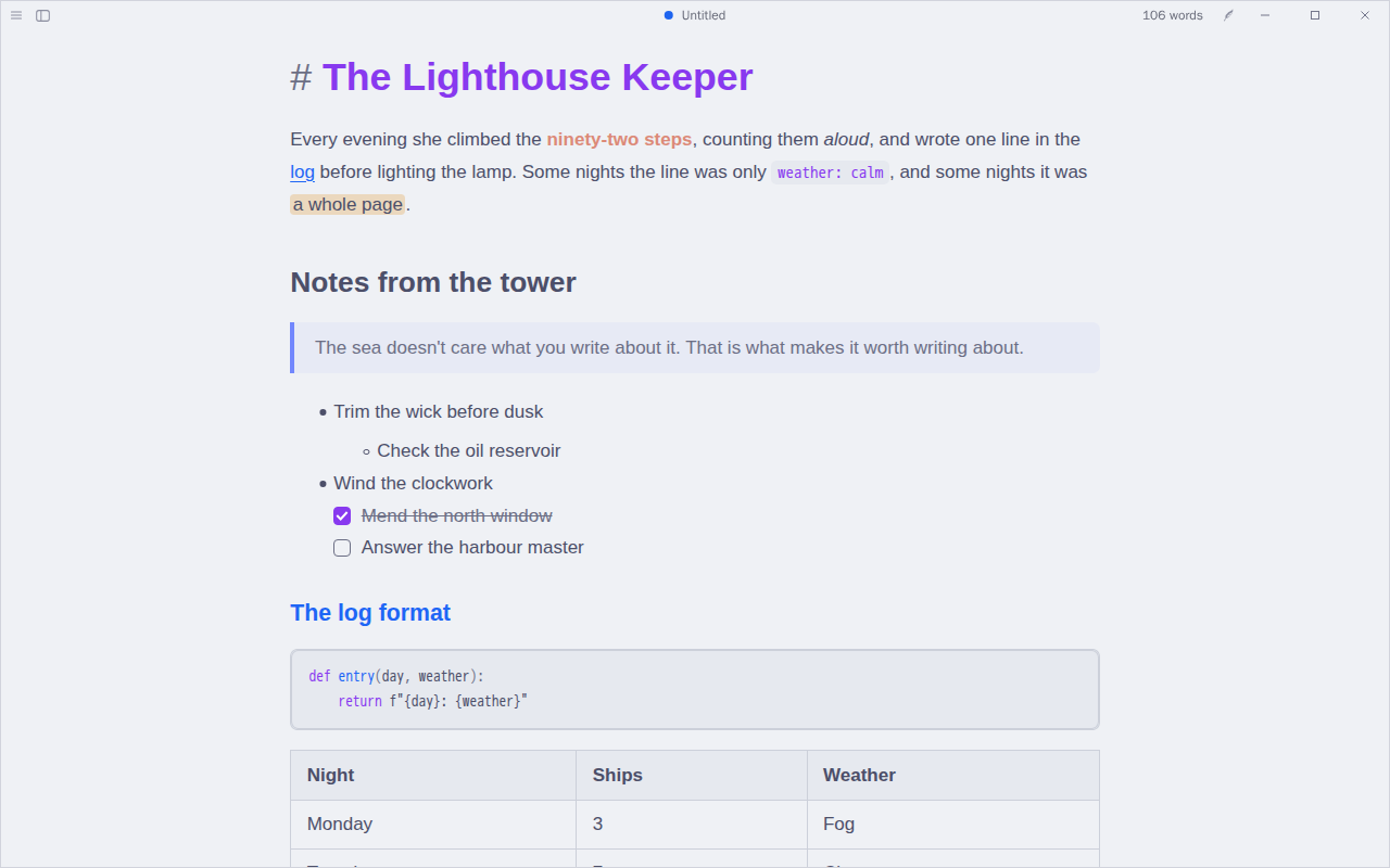
만든 사람 @CatVinci-Studio · MIT
Soft pastels for long sessions: a cool latte page by day and a deep mocha one at night, a mauve title, blue section heads, lavender quotes and a rosewater bold. An unofficial port of the Catppuccin palette.
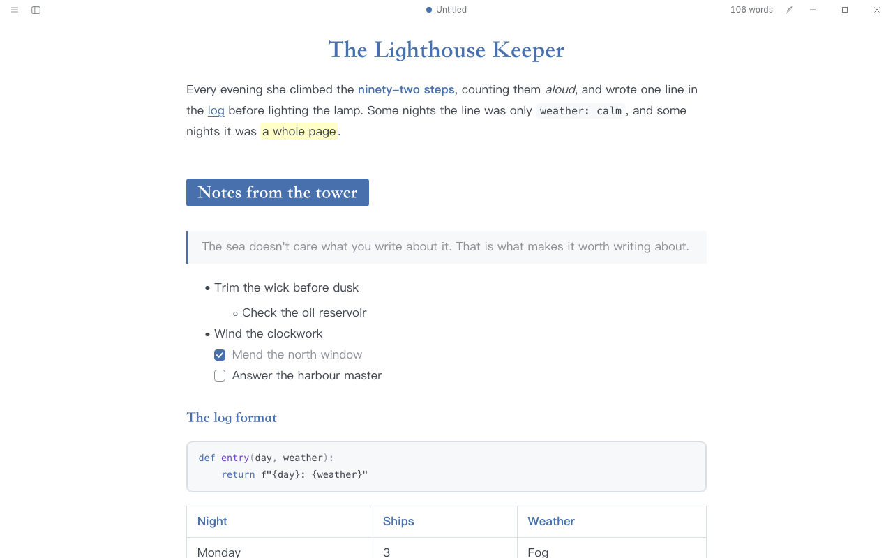
만든 사람 @CatVinci-Studio · MIT
Indigo and clear: a centred title, level-2 headings on a solid blue band, serif headings over a sans body, blue bold and blue list markers. After Lapis by YiNN.
만든 사람 @CatVinci-Studio · MIT
Vivid and nocturnal: the classic dark purple-grey page with neon accents, and a warm cream day page with deeper ones. On the Dracula and Alucard palettes.
만든 사람 @CatVinci-Studio · MIT
Colours of an old woodblock print: Kanagawa's lotus paper by day and the deep ink of the wave at night, indigo and violet headings, a red bold and soft green strings. On the Kanagawa palette.
만든 사람 @CatVinci-Studio · MIT
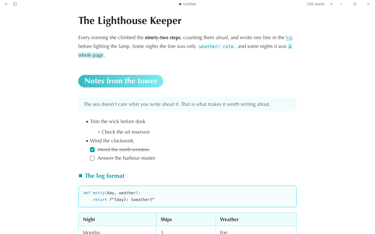
Fresh and lively: level-2 headings on a mint pill, small markers before the smaller headings, a dashed rule and tinted quotes, with a calm sea-dark night. After Phycat by sumruler.
만든 사람 @CatVinci-Studio · MIT
Textus's default look without the heading marks: the same type and colours, with plain level-3 and level-4 headings.
만든 사람 @CatVinci-Studio · MIT
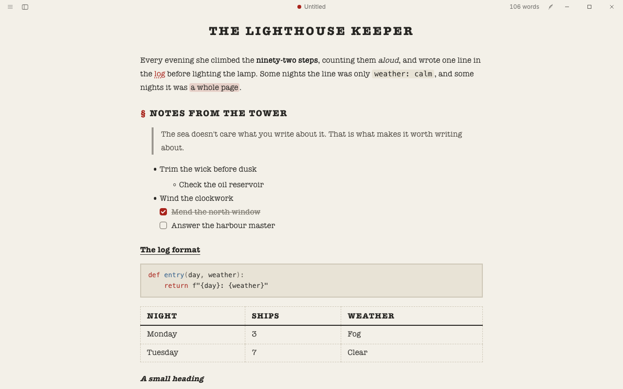
A typewritten draft: typewriter type on off-white paper, a narrow page, uppercase headings with section marks and a ribbon-red accent.
갤러리가 막 문을 열었습니다. 첫 번째 테마를 공유해 보세요. 갤러리 이슈에 CSS와 스크린샷을 올리면 관리자의 검토를 거쳐 여기에 나타납니다.
테마 공유하기새 패널, 파일 형식, 도구. 대부분 iPhone과 iPad에서도 컴퓨터처럼 작동합니다.
한 가지 일을 잘 해내는 방법을 Textus AI에게. / 메뉴에도 나타납니다.
사실을 더하지 않고 글을 풍성하게 만듭니다
공식글쓰기
원하는 길이로 충실하게 요약합니다
공식글쓰기
군더더기를 덜어 내고 사실은 모두 남깁니다
공식글쓰기
원어민이 쓴 글처럼 읽히게 번역합니다
공식글쓰기
내 문체로 다음 장면을 쓰고, 라이브러리 설정과 맞춥니다
공식글쓰기
더 격식 있게, 쉽게, 따뜻하게 또는 단호하게 바꿉니다
공식글쓰기
AI 특유의 상투적인 표현을 걷어 내거나 짚어 주기만 합니다
공식글쓰기
문서 언어의 규칙에 맞게 대사의 문장 부호와 인용 표현을 바로잡습니다
공식글쓰기
인물, 장소, 장면에 구체적이고 감각적인 묘사를 더합니다
공식글쓰기
예문이나 문체 프로필의 문체로 다시 씁니다
공식글쓰기
이메일이나 편지의 초안을 쓰거나 구성을 다듬습니다
공식글쓰기
논문과 연구계획서를 상투적 표현 없이 정확하고 절제된 학술 문체로 다듬고, 수치와 인용은 그대로 둡니다
공식글쓰기
메모를 결정 사항과 할 일로 정리합니다
공식글쓰기
라이브러리나 다른 장과 어긋나는 부분을 찾습니다
공식검토
공지나 공문서를 작성하거나 고칩니다
공식글쓰기
내용에 맞고 길이가 알맞은 제목을 붙입니다
공식글쓰기
플랫폼의 글자 수와 규칙에 맞는 게시물을 씁니다
공식글쓰기
강의 메모나 장을 확인 문제가 있는 학습 노트로 정리합니다
공식글쓰기
채용 공고와 이력서로 자기소개서를 씁니다
공식글쓰기
메모나 공지를 보도자료로 씁니다
공식글쓰기
여기 있는 확장은 모두 무료이며 오픈 소스입니다. 플러그인을 설치하기 전에 Textus가 필요한 권한을 보여 줍니다.